Text.Wang Yu
The Taichung Green Museumbrary (referred to as “Green Museumbrary” below) is Taiwan’s first cultural institution complex of an art museum and a public library. Designed by Tokyo-based architectural firm SANAA, founded by Sejima Kazuyo and Nishizawa Ryue, in collaboration with Ricky Liu & Associates Architects+Planners from Taiwan, the Green Museumbrary is expected to be inaugurated by the end of 2025. To prepare for this highly anticipated moment, the Green Museumbrary’s visual identity (VI) design has been announced this year, aiming to establish an initial impression in the public’s minds while gradually developing the brand image of this new cultural institution.
The design of the VI system began during the architecture planning stage when SANAA invited aaroniehworkshop led by Aaron Nieh to take charge of the design. Their goal was to create a visual image that closely matched the architectural style and ideas of the institution. SANAA has consistently expressed a desire to collaborate with local teams when implementing architectural designs around the world. In selecting a designer for this project, they aimed not only to ensure harmony between the design style and the architecture but also to provide opportunities for Taiwanese teams. They believe that Taiwan has many talented designers who meet international standards. Moreover, Taiwanese designers possess a deeper understanding of local cultural context and customs compared to foreign teams, allowing them to create design vocabularies that effectively interpret local cultural characteristics and this interdisciplinary cultural landmark.
Visual Thinking Extended from the Architecture
The VI system centers on the architecture of the Green Museumbrary and visually bridging the Taichung Art Museum and the Taichung Public Library, emphasizing the connection between art and knowledge while highlighting the transparency and fluidity embodied by the architecture to create an internationally recognized image for the cultural institution.
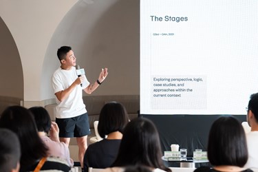
Nieh shared the preliminary process of ideation and discussion. They began by focusing on the “Taichung Green Museumbrary,” breaking it down into three components: Taichung, green, and architecture. They then analyzed these components from the perspectives of“geopolitics,” “city property,” and “architecture and space.” He further explained the rationale behind the design process. For instance, in terms of “geopolitics,” a common approach is to base the design around the name of the city (e.g., the Mandarin character“中”[chung] in“臺中”[Taichung]). Regarding“city property,” the team focused on the site being the largest urban green space and expanded this idea to include other imagery, such as parks and sustainable forests. when discussing “architecture and space,” they emphasized the architectural characteristics of the Green Museumbrary as a landmark, its interdisciplinary and integrated space, and the concept of cultural identity. After extensive discussions within the team, they concluded that the significance and uniqueness of the Green Museumbrary’s architecture made it suitable for various visual extensions and interpretations. Ultimately, they decided to develop the design primarily based on “architecture and space.”
The uniqueness of the Green Museumbrary architecture lies in the fact that the library and the museum are independent buildings but are connected through spaces at the same time. Nieh’s team identified eight key terms from the architectural design elements, including unit series, semi-visible, overlapping, slices, posture, fusion, split-level, and cube. They then translated these terms into linear and geometric visual images to formulate design strategies and create at least six proposals for discussion with SANAA and the city government.
A Concise and Memorable Design Aesthetic
After extensive communication between the design and architecture teams, the logo for the Green Museumbrary has been finalized. It consists of two vertical straight lines, forming a framework with a blank center, symbolizing this cultural site being open to the public and allowing everyone to fill the blank space with their personal experiences. Nieh explains that, instead of limiting people’s imagination with visually specific and concrete elements, a blank space offers a better opportunity for individuals to freely bring in their own thoughts and feelings. In addition, the logos of the library and the museum are also derived from this framework while incorporating their separate cultural implications, along with their distinctive building characters. The museum logo resembles line drawings made during the first doodle, whereas the library logo evokes the image of books leaning against a bookstand. When the logos are rotated 90 degrees, it becomes apparent that the logos also reflect the unique architectural features of the buildings, such as the spiral slope under the raised ceiling of the museum’s lobby and the library’s steep, straight escalator. Within the concise, clean framework formed by two vertical lines lies the unlimited potential for imagination, encompassing both concrete and abstract ideas.
According to Nieh, an effective VI design should be distinctive, memorable, adaptable, simple, and timeless. He emphasized that the simpler a logo is, the more likely it is to stand out among numerous images and be remembered by the public. Additionally, it should also be adaptable to various contemporary media, whether graphic, digital, or social. When discussing the VI color, Nieh stated that a neutral black-and-white palette is the easiest to work with, ensuring that the visual effect remains consistent across different applications. For the museum’s wayfinding system, the team created a custom Mandarin logotype called “Qing Fang” (literally translates to “light square”) whereas the English logotype is based on “AA Grotesk,” a font developed by aaroniehworkshop. In the VI design, the English is presented entirely in lowercase to symbolize “the removal of authoritarianism and a closer connection with the public,” a principle embraced by many international cultural institutions. The overall VI design also expresses the design team’s anticipation for various cultural events that will be held in the Green Museumbrary, offering a more diverse narrative space for its visitors.

 Facebook
 Twitter
 LINE
LINE
